|
|
|
|
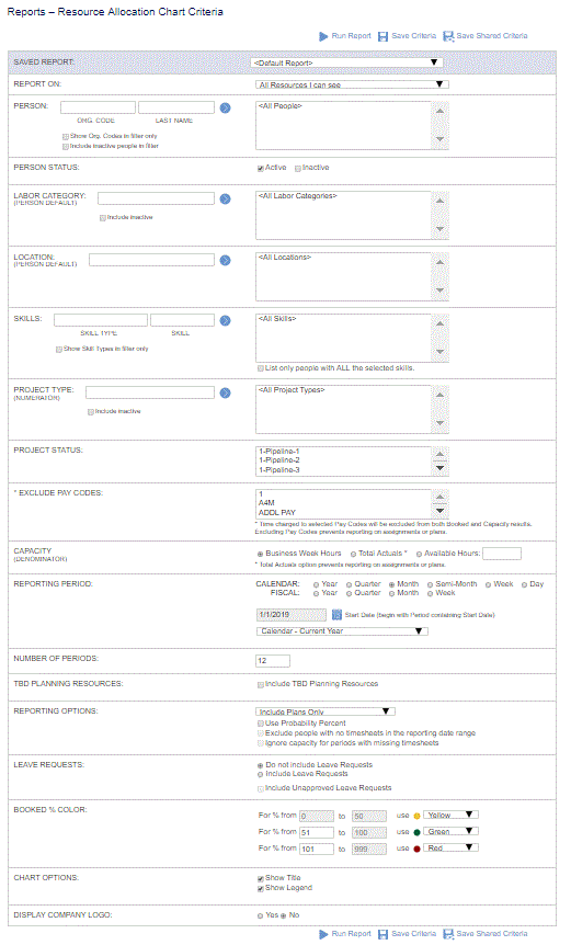
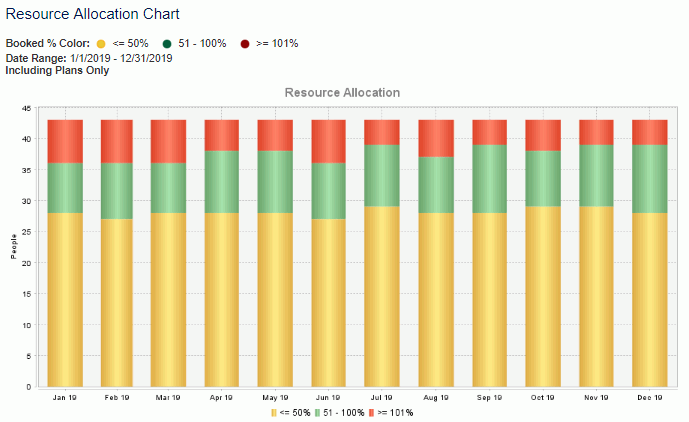
This chart can be run to provide information regarding how booked your resources are in terms of either plans, assignments or actuals (and can optionally add requested leave on top) in a Daily, Weekly, Semi-Monthly, Monthly, Quarterly or Yearly bar chart format. The user can configure the allocation colors and percentiles. Each bar in the chart can represent the number of people whose allocation falls within the user-defined percentile for the period.
Click Through for Details
You can click on a bar within the chart to run a Resource Allocation report for the one period represented by the bar. The report will be configured to use plans, assignments or actuals as applicable to a given bar.
Topics covered on this help page include:
Selection Criteria (options available to tailor chart output)
You may also be interested in:
Dashboard Management (charts can be added to one of your dashboards)

|
|
|
